Business Card Font Size

Business Card Font Size
Readability and Subjectivity:
Business card font size preference is highly subjective and varies from person to person. Some individuals prefer smaller fonts as part of their design intention to create a dynamic typographic layout. Others may require larger font sizes to cater to their target audience, such as retirees who commonly have less optical eyesight. When determining the ideal font size, it is essential to strike a balance between aesthetic appeal and readability.
Client Experiences and Best Practices:
Throughout our experience, we have encountered situations where customers were satisfied with 3.4pt font size, while others were disappointed with an 8pt font size they found too small. These examples highlight the subjective nature of font size and the importance of individual preference. As a best practice, we recommend clients verify the font size personally to ensure their satisfaction with the final output.
Subjective Nature of Font Size:
It’s crucial to understand that font size is highly subjective and personal. What may be considered readable by one person might appear too small or too large to another. Therefore, we always advise clients to physically review and approve the font size before proceeding with the printing process.
Based on our 15 years of experience in business cards printing, we have observed and recommend the following business card font size ranges for your reference.
1pt to 4pt – Not for reading
These font sizes are too small to read. However its fine if you are doing it for design / background.
5pt & 6pt – On the Small Side
These are small font sizes that still readable but not friendly to old people.
6.5pt to 9pt – Normal for Reading
These are the safe rage that most people use.
10pt to 13pt – Consider Big in Business Card
Big font sizes are suitable to be used for Company Name, the Person Name, and some used on Contact Number.
14pt UP – HUGE!
Good to present your BRAND NAME. Some used it for background.
Business Card Font Size
When it comes to business cards design, business card font size plays a crucial role in determining the readability and overall impact of the card. It is not uncommon for customers to request very small font sizes or inquire about the minimum size that can be printed. In this article, we will explore the topic of business card font size and provide insights based on our experience in the industry.
Business Card Font Size Benchmark Card:
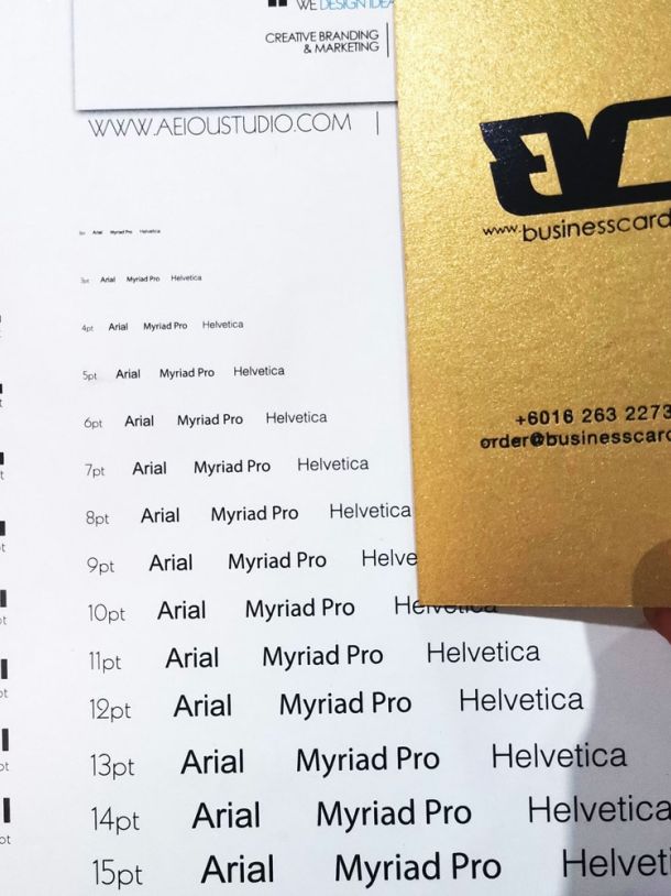
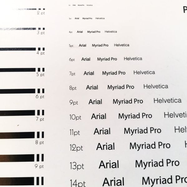
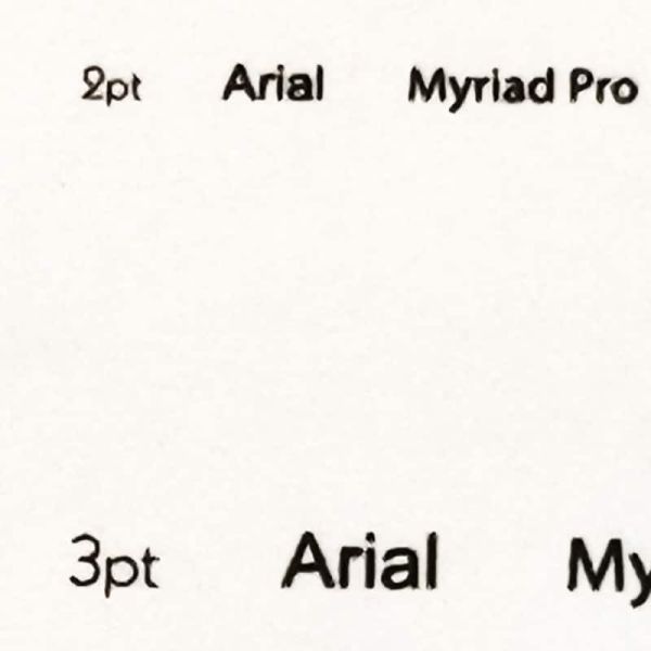
To address the concerns on business card font size, we have printed an offset printing font sizes bench-marking card. Referring to the image, font sizes ranging from 2pt to 15pt for popular fonts like Arial, Helvetica, and Myriad Pro were printed. It shows that offset printing can output fonts as small as 2pt. However, while the technology allows for such small font sizes, readability remains a significant consideration.


Font sizes can vary depending on the type of font used. For instance, the height of certain fonts at 11pt may be equivalent to Arial at 7pt. Therefore, the font size suggestions provided above are based on Arial, Helvetica, and Myriad Pro fonts, which serve as benchmark references.
It’s important to note that font size preference is subjective and varies from person to person. As a designer, I believe that design elements and intentions play a crucial role in creating an impactful business card. At the same time, it’s equally important to ensure readability in the design.
Finding the right balance between design elements and readability is key. As designers, we should strive to create visually appealing cards that effectively convey the intended message while ensuring that the text is legible and easy to read.
Next: Font sizes for business cards fabrication (coming soon..)

